![](https://www.v1s.fr/fichiers/_thumbnails/projet/11/illustration/1600x730/format-1280x584.jpg)
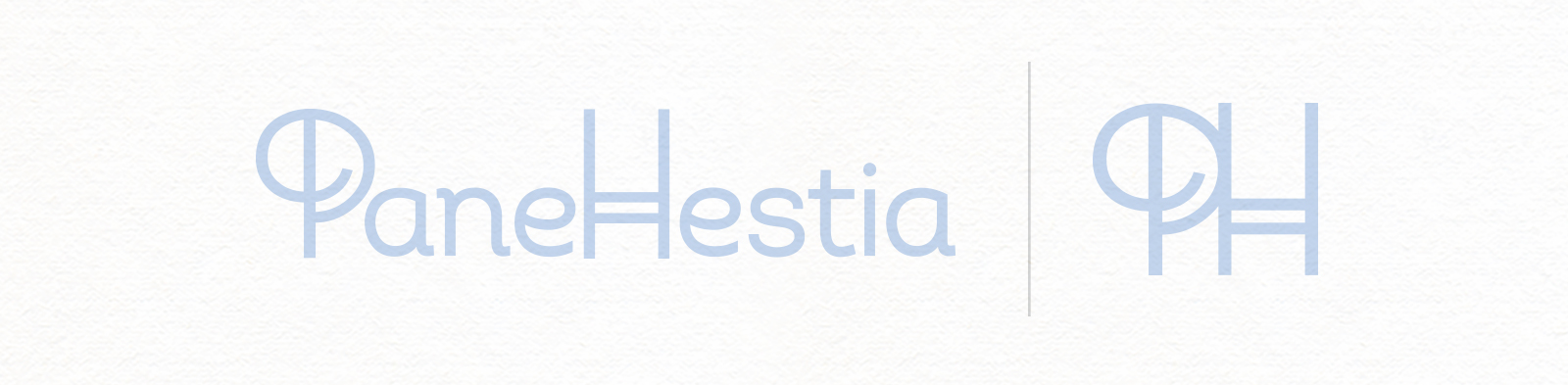
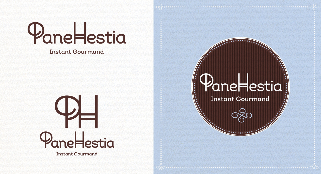
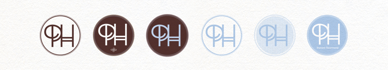
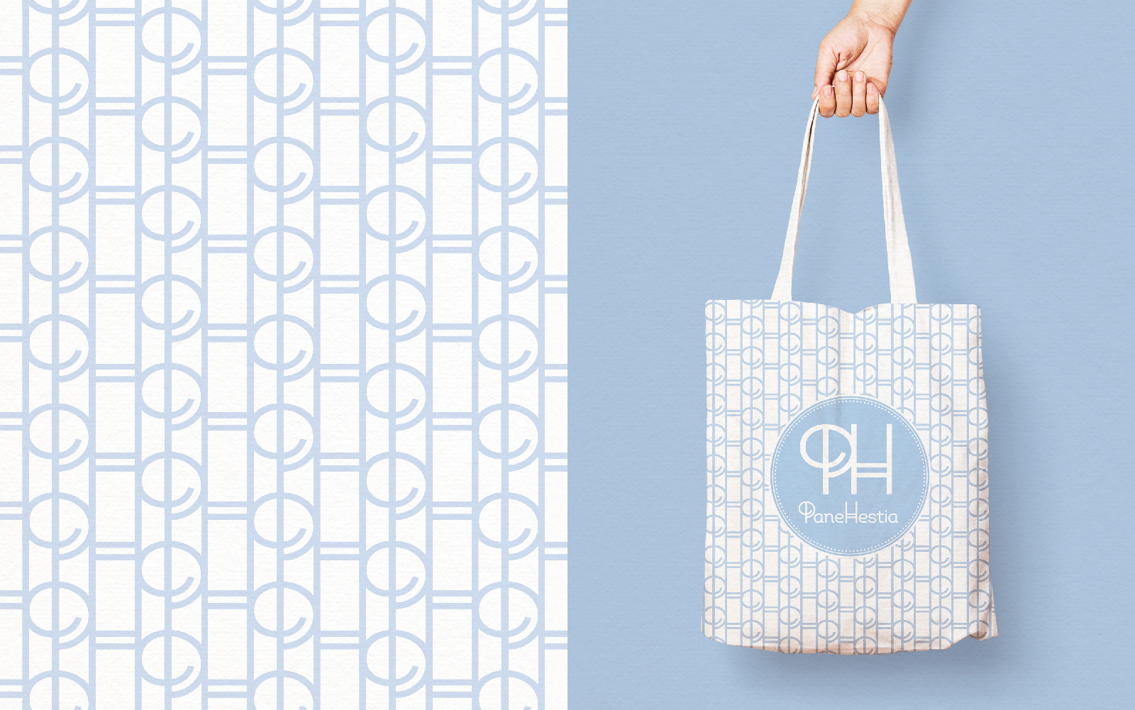
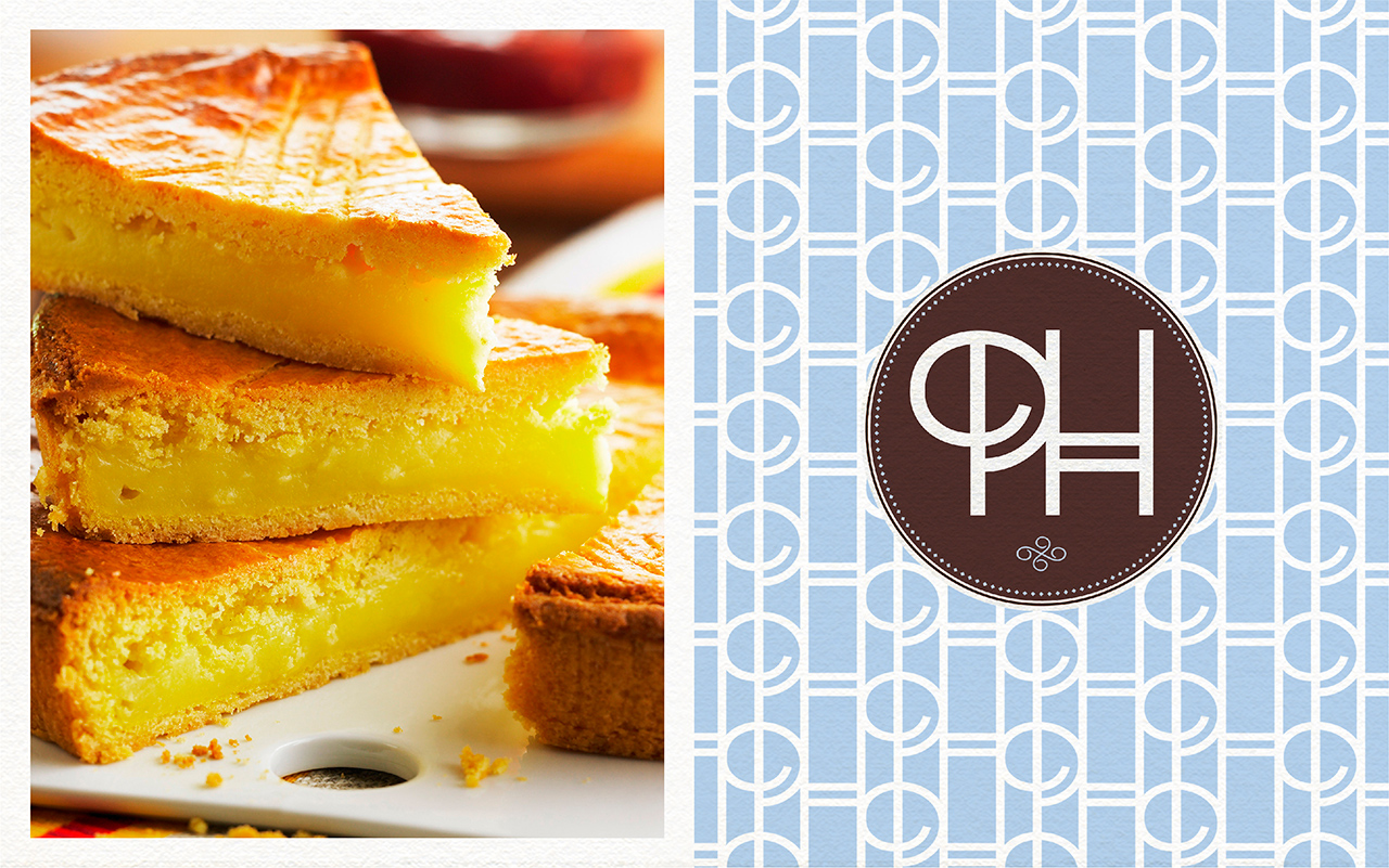
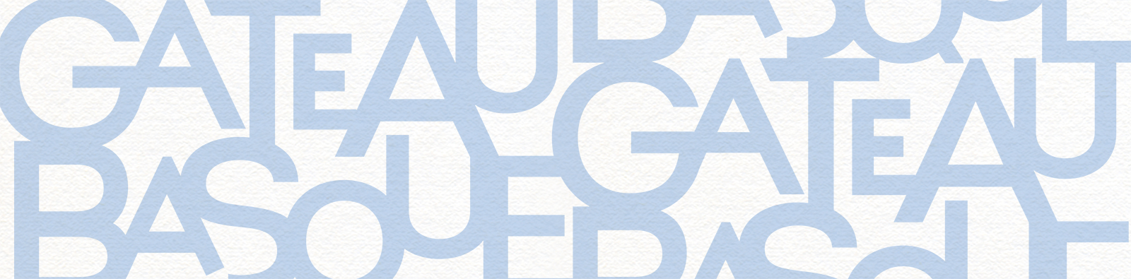
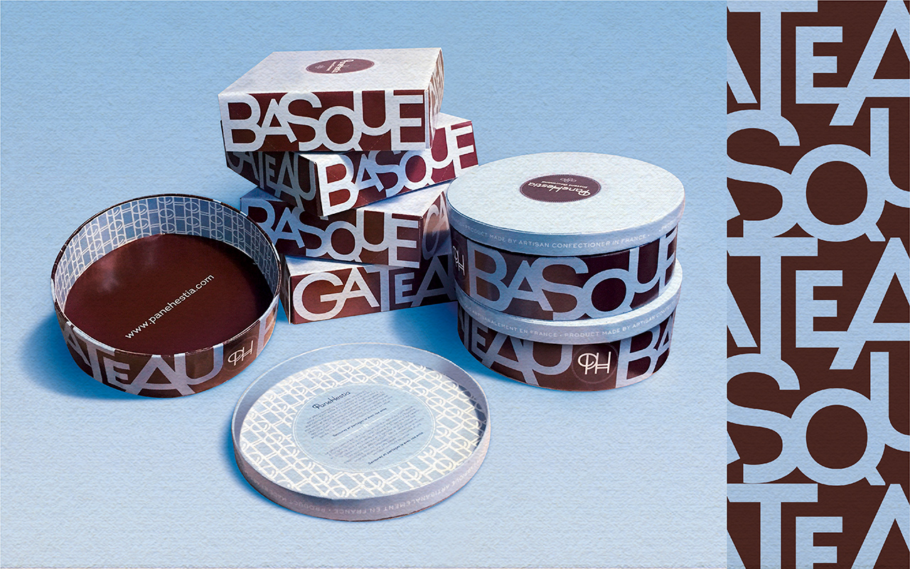
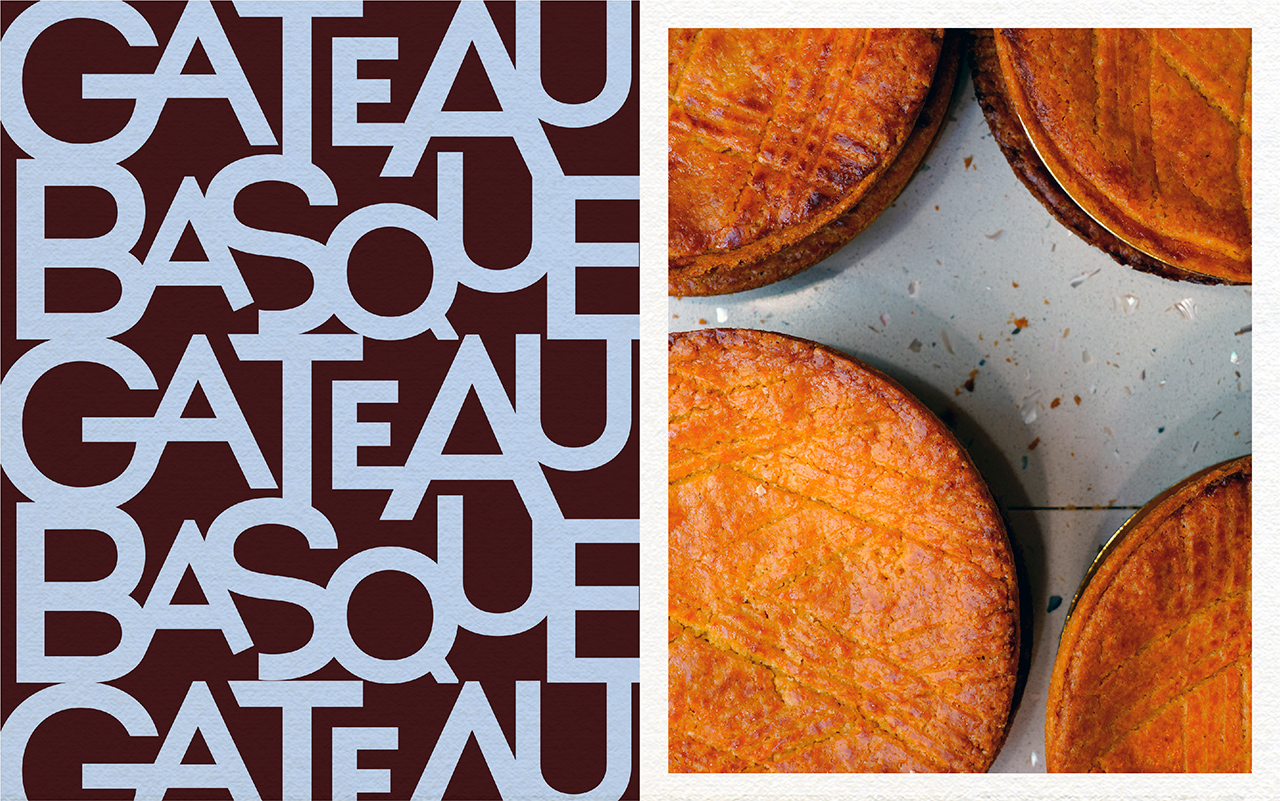
Afin d’asseoir son origine française la typographie est volontairement raffinée mêlant par son traité et ses couleurs, la gourmandise à la modernité. Un monogramme comme symbole de marque, pouvant aussi se traduire par de la dentelle en pattern. Une identité visuelle destinée a séduire le marché scandinave. Bon appétit !
![](https://www.v1s.fr/fichiers/projetpart/125/image/TYPO-SYMBOL.jpg)
![](https://www.v1s.fr/fichiers/projetpart/51/image/Fond-1line.jpg)
![](https://www.v1s.fr/fichiers/projetpart/46/image/p8-Panehestiab.jpg)
![](https://www.v1s.fr/fichiers/projetpart/47/image/p7-Panehestia.jpg)
![](https://www.v1s.fr/fichiers/projetpart/126/image/p1-Panehestia.jpg)
![](https://www.v1s.fr/fichiers/projetpart/50/image/cas-PANEHESTIA-02.jpg)
![](https://www.v1s.fr/fichiers/projetpart/124/image/fond-3line.jpg)
![](https://www.v1s.fr/fichiers/projetpart/48/image/cas-PANEHESTIA-04.jpg)
![](https://www.v1s.fr/fichiers/projetpart/44/image/cas-PANEHESTIA-09.jpg)